Let’s face it, most of us are spending MUCH more time at home than we ever have. I’ve never had a greater desire than I do right now to create a comfortable haven that is a true reflection of me and my family. Our homes are our sanctuaries and being comfortable in our surroundings has never seemed more important. Have you ever walked into a room in your home and suddenly, as if for the first time, you finally “see” that weathered, circa 1995 chair that’s been taking up residence in your family room for years? And at that very moment, you decide, “I can’t stand this!” Well, me too. In fact, I am personally guilty of making many design mistakes. But, if I can change, you can too! Here are some easy ways you can update your home by avoiding 3 common décor mistakes. Let’s dive into these design dilemmas, and how to fix them!

1) Update Your Home – No Frumpy Furniture
Let’s start with what is probably the most egregious offense – living with furniture you hate. You can put as many new throw pillows on that old, overstuffed marshmallow couch as you want, but if it’s not comfortable, if it’s beaten down, and if it no longer reflects your style, it’s time to part ways. Just like we update our clothes and beauty products, updated home décor will just make you FEEL better.
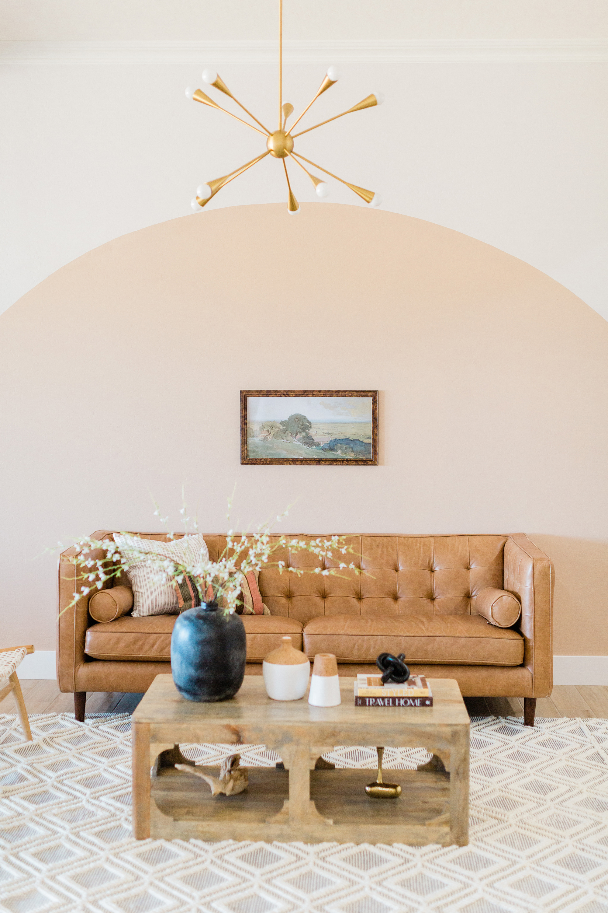
Think about the fact that a couch is the anchor piece of a room and it’s likely the one piece of furniture that gets the most use. It might be time to invest in a couch that is comfortable, updated, functional and fresh. Move toward clean lines and less “overstuffed” fabric. A whiskey brown couch in durable leather (hi kids and pets) would work well in most rooms if you are looking for something neutral and timeless.

2) The Right Length for Window Treatments
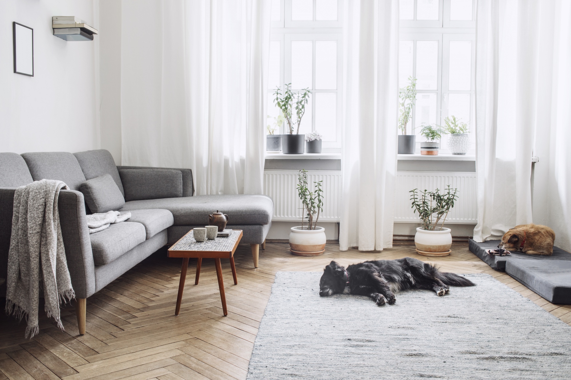
Window treatments are like the cherry on a sundae and offer a chic, “finished” look if you hang them correctly. Hanging curtains so they hit mid-wall or too low from the window frame makes the room look smaller and dwarfed – a VERY dated look. Big mistake. Curtains should be hung at least 6-12 inches above the window frame. You should also add between 5-8 inches of space on either end of the sides of the window so if the curtains are open you are not covering the window. This will elongate the window and define the space to make it look grander. For the right length, curtains should barely kiss the floor.
There are so many patterns, fabrics, and textures to choose from, but Pottery Barn has lots of high-quality options.

3) Themed Rooms Are Out
Having an overly themed room is another frequent design mistake! Does your family room cry Ahoy Matey or Meee-oww? It might be time for a change. Now I was definitely an offender of this in seasons past. For me, I realize less is more when it comes to word art around my house. I’m a writer. I love words and quotes, but I suppose they don’t need to be all around me. I’m pretty sure I can remember to live, laugh, and love, even without the daily visual reminder to do so. Don’t get me wrong, I’m not giving up on words completely, but I am keeping my wall art more personal. I started framing maps of places we’ve traveled (remember traveling?), letters, and music sheets. I recently purchased a commissioned illustration from this Etsy artist and the rendition created brought me to tears. Now that’s personal!
Bonus Tip: Select Meaningful Décor
It’s not a race. I know you want to get each room finished so you can sit back, take in the design, and marvel at your work, but finding the perfect pieces for your home takes time. Don’t settle for “mostly OK” or “almost” good enough. When you update your home, fill it with meaningful pieces you love.
These are just some tips to get you off the struggle bus if you’ve been a passenger for decades, but in the end, your space should reflect YOU and whatever brings you joy! For more design inspo, check out this post on updating your powder room or this one on finding the perfect rug for your space. What design mistake are you eager to correct? We want to hear all about it so please share in the comments.
To get blog posts delivered directly to your inbox, along with some awesome freebies, be sure to sign up for the newsletter here.


COMMENTS